Start trading with PREDICTIVE indicators

We live in the most technologically advanced world the industry of trading has ever seen, and yet most traders in spite of all of the available power to them are still using their current day computers to do nothing more than generate low power lagging indicators that tell them what just happened. No one uses predictive indicators in forex, futures, equities, commodities....nothing.
Three years ago, my partners and I discovered something...a phenomenon we didn't think could possibly exist. We discovered that if you looked at thousands of bars of historical data patterns began to appear in time, price, and price action. Simply stated, studying what the algorithms of the institutional traders did revealed an order in the markets. Moves that occurred at certain times. Prices that became support and resistance. Price action that almost always indicated a shift in the algorithm's appetite.
Moreover, we discovered that these times were PREDICTIVE. These prices were PREDICTIVE. You could identify the times the market would start to trend....identify the times the market would stop and reverse....days in advance. You could identify the prices that were going to be support and resistance hours in advance. From a psychological standpoint, we'd realized that there was an alternative to staring at our monitors all day, wondering if the next tick or range bar would be our entry. Now, we could be at our computers with full focus at pre-determined times of the sessions, studying the conditions to verify if what we were expecting to happen again, was actually happening.
Watch this short video about how our FLUX histogram indicator - the heart of trading "time travel" locates those cycles...
In the above video, we analyzed 10,000 historical data bars in a matter of seconds to determine if there were any cycles in the EURUSD 15 minute time frame. The histograms quickly indicate if there are in fact cycles that repeat with enough predictive consistency as to display on the chart like a "wave". The max and mins of those waves are calculated out into the future, and as we get closer to the time for that wave to reverse, we receive warnings on our screen, and markers that helps us identify the turns:
It's important to realize as you're watching that video, that the dots - the markers - have nothing to do with price action that day. In fact, they have nothing to do with price action at all. They are simply reminders that "now" is the time to expect something. A red dot plot on the 9:30 bar is saying - "Now is a statistically significant turning time in this market, on this time frame....watch for a big down move here". It's a time that you've been waiting days for.
As I mentioned earlier though, time isn't the only dimension of trading that we can analyze with predictive accuracy. Just as we are able to analyze time cycles in the ocean of available historical data, we are able to analyze price in the same respect. We can ask our computer to look at historical price with the intention of finding ALL of the prices where the market put in a pivot - stopped and reversed - reflected. When we do that, we create a database of those prices. We can see how many times in the past "'x thousand" bars did the market stop, and reverse at price "Y". We can filter out the top 2,5,10, 20 percent of those prices, and display those prices on our chart before the market opens.
Why? Because if the market stopped at price "X" 216 times in the past 5000 bars, there is a statistically high chance that the market will stop and find support or resistance there in the future. What makes the Flux prices different though, is that they are based entirely on an aggregate count of ACTUAL market pivots. It's a statistical analysis of actual market support and resistance. It is the 'cream of the crop' of algorithm pivots. The market simply cannot help but stop and bounce at these prices, for whatever reason. Prices that are not obvious to the human eye - but glaring to the "computer eye of data mining.
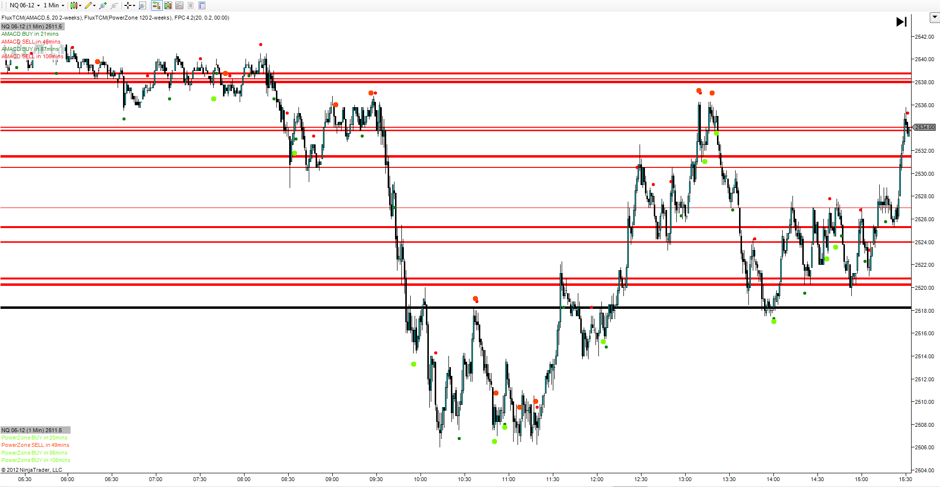
Here's an example of a chart with the Flux Fractal Pivot Confluence lines overlaid: (click HERE to see enlarged)
The first thing you notice is how the price action behaves around the FPC lines. It's bouncing off of these areas----moving through them like a "bus schedule", almost. Test this level....break though....test the next level....break through, and so forth.
The second thing you see is how some of the lines are darker and brighter, others softer and lighter. You see where 'clusters' of support and resistance are, as well.
The third and most important thing you see, is probably one of the most exciting discoveries we came across. The "intersection of time and price"
Go back and look at that chart. Can you find any places where we had a time signal (green or red) indicating a potential move up or down, at SUPPORT or RESISTANCE?
See if you see any RED dots at or near resistance.....or GREEN dots at or near support.
The closer the price is to support when an up move is predicted, the lower the risk to test that market...and the higher the reward.
The closer the price is to resistance when a down move is predicted, the lower the risk to test that market...and the higher the reward.
Again - two predictive indicators, based entirely on what the markets USUALLY do...not what some black box indicator says "might" happen...or a lagging indicator telling you what "just" happened.
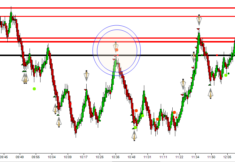
Finally, we set out to produce a PRICE ACTION indicator. We wanted to know if the turn we were anticipating to happen, near the prices we were anticipating the turns to happen at, were actually happening. It's one thing to have a predictive indicator, but quite another to blindly follow that indicator with no present confirmation. It was after many months of studying price action the same way we were studying time and price, that the Flux BROADHEAD was born. Look at this chart:
It's the same chart I just showed you above, with 2 differences.
First, I've changed the bar type from a 1 minute time frame, to a 5 range bar. The Broadhead, turns out, works best on a NON-TIME bar. So Renko....Tick....Range....Line Break....any bar that does't have a time component, and the BROADHEAD is deadly accurate at indicating turns.
Next, I've overlaid the TIME study, on top of the PRICE study, on top of the BROADHEAD study. Look at what happens when all three of those studies come into phase together. Reversal, at resistance, at the time the market is supposed to fall down hard. And it does. Over 10 points.
It's one thing to see and read this on our website, and another thing altogether to witness it for yourself. That's why around 2.5 years ago I started doing something no other tool vendor in this industry was doing - I started giving out the forecasts for the time turns 2 days in advance of our webinar. I was essentially daring people to see if this was for real or not. (That's why it's important that you sign up to be on our mailing list - you'll get these forecasts in your inbox on Tuesday for the markets on Wednesday and Thursday).
Inevitably, without fail, I ask them at every webinar - "What % of the time did the market do what was forecast, at those times?"
60-70%....75%........70%..........65%...........60-70%.............never an answer under 60%. That that blows people's minds wide open.
Going on 3 years now - over 200 webinars and 500 customers later - these cycles still continue to excite and mystify me in their accuracy, and repetition.
Go the next step, and learn for yourself how these cycles work - and are found...and make sure you sign up to receive these mailings, and get our webinar invitations.
CLICK HERE TO WATCH OUR ONLINE WEBINAR AND LEARN MORE ABOUT TRADING WITH FLUX CYCLES
OR
I'VE SEEN ENOUGH AND WOULD LIKE A PERSONAL 1:1 CONSULTATION TO SEE HOW THIS WORKS ON MY MARKETS

